Building UI
Toolpad allows you to build your frontends fast so you can concentrate on writing logic
Component Library
In order to access a list of built in components, hover over the Component library vertical bar to make it expand:
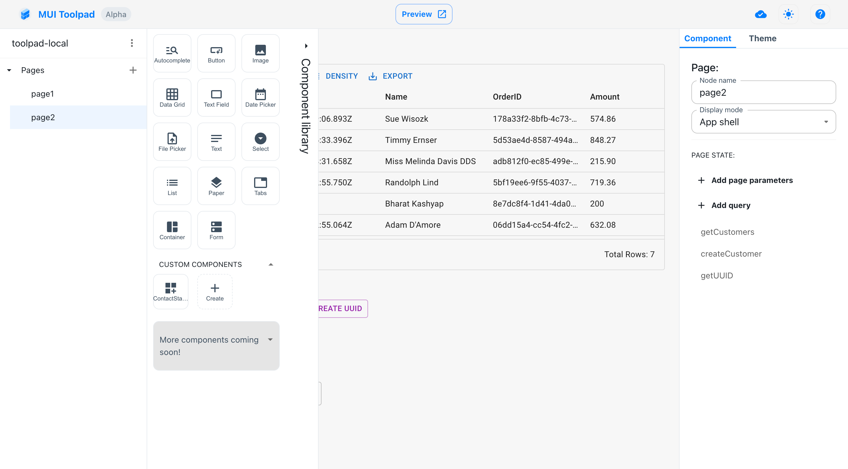
The Toolpad Component Library
Currently supported components:
- Button - Use a button to capture user actions through a click.
- Image - Display different types of images.
- DataGrid - Use the MUI X data grid component and easily render various types of tabular data.
- Text Field - Capture text from user input.
- Date Picker - Select a date from a date picker.
- File Picker - Select a file from the file system.
- Text - Present text content. Can be either plain text, markdow or links.
- Select - Capture user input from a list of options.
- Paper - Provide a visual differantation for your components
- Tabs - A tabs strip that can be used to shift between different views.
- Container - A wrapper element that can be used to hide or show its children.
- List - An array of components presented as a repeating list.
We are working hard to add even more components. To make it easier for us to understand what should be added first, please help by upvoting components.
Adding components
- With the component library open, click on a component and drag it over the canvas.
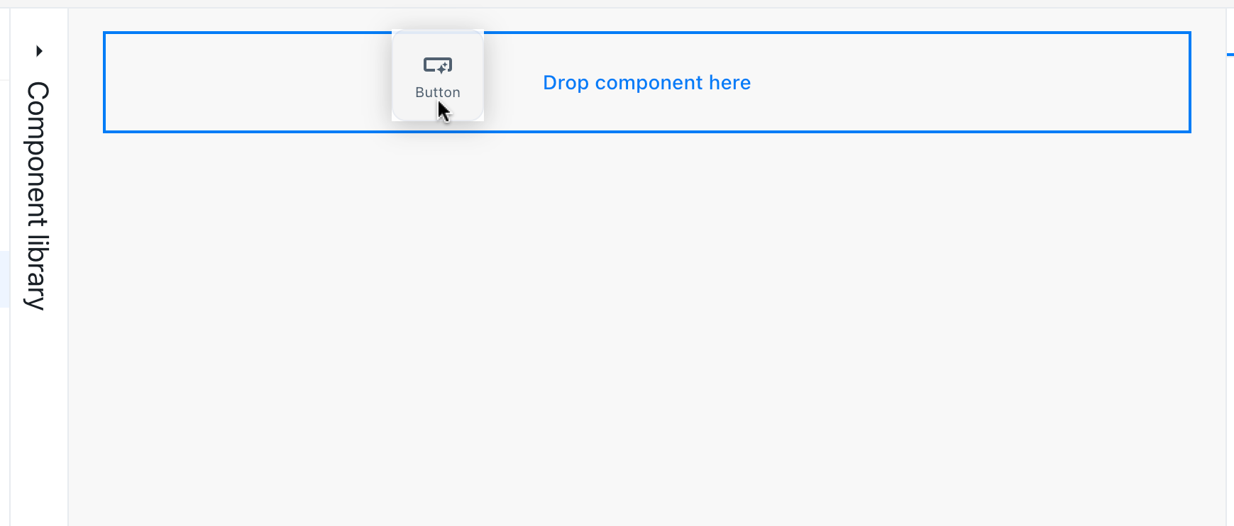
Dragging a component to the canvas
- The canvas will highlight the location where a component can be dropped. Release the mouse to place the component on the canvas.
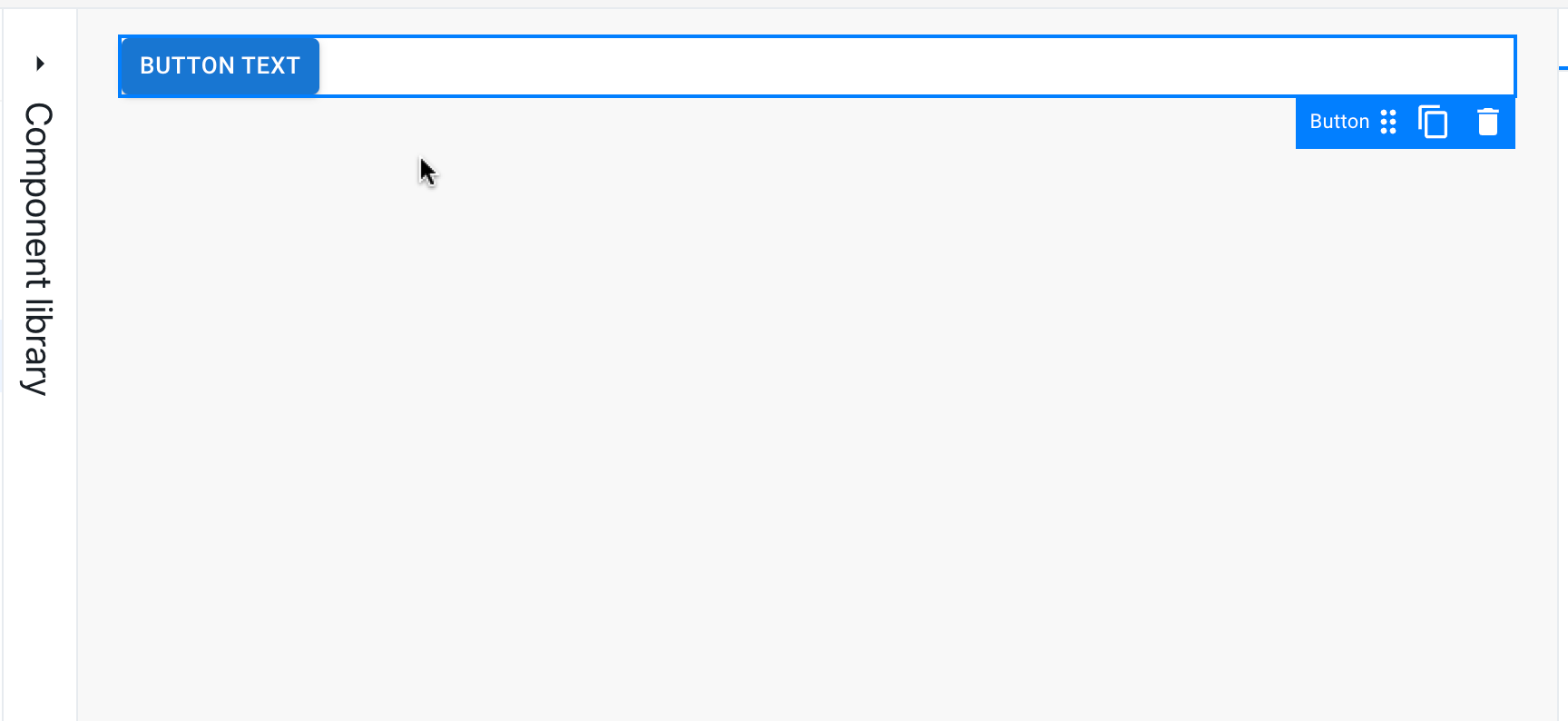
Placing a component on the canvas
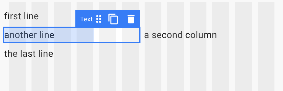
Selecting components
Click any component in the canvas to select it. An overlay indicates the selected components.
Selecting a component
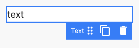
Moving components
In order to change position of a component, first you must select it. Then, click on the drag handler present in the overlay handle, drag it, and drop it at its new location. The canvas will highlight available drop locations with a blue indicator.

Moving a component
Removing components
Select the component you want to remove. Click the bin icon in the overlay to remove it from the canvas. You can also press the Backspace key to achieve the same result.
Inspector
Each component has a specific set of properties that you can tweak in the inspector panel. This is available on the right side upon selecting a component.
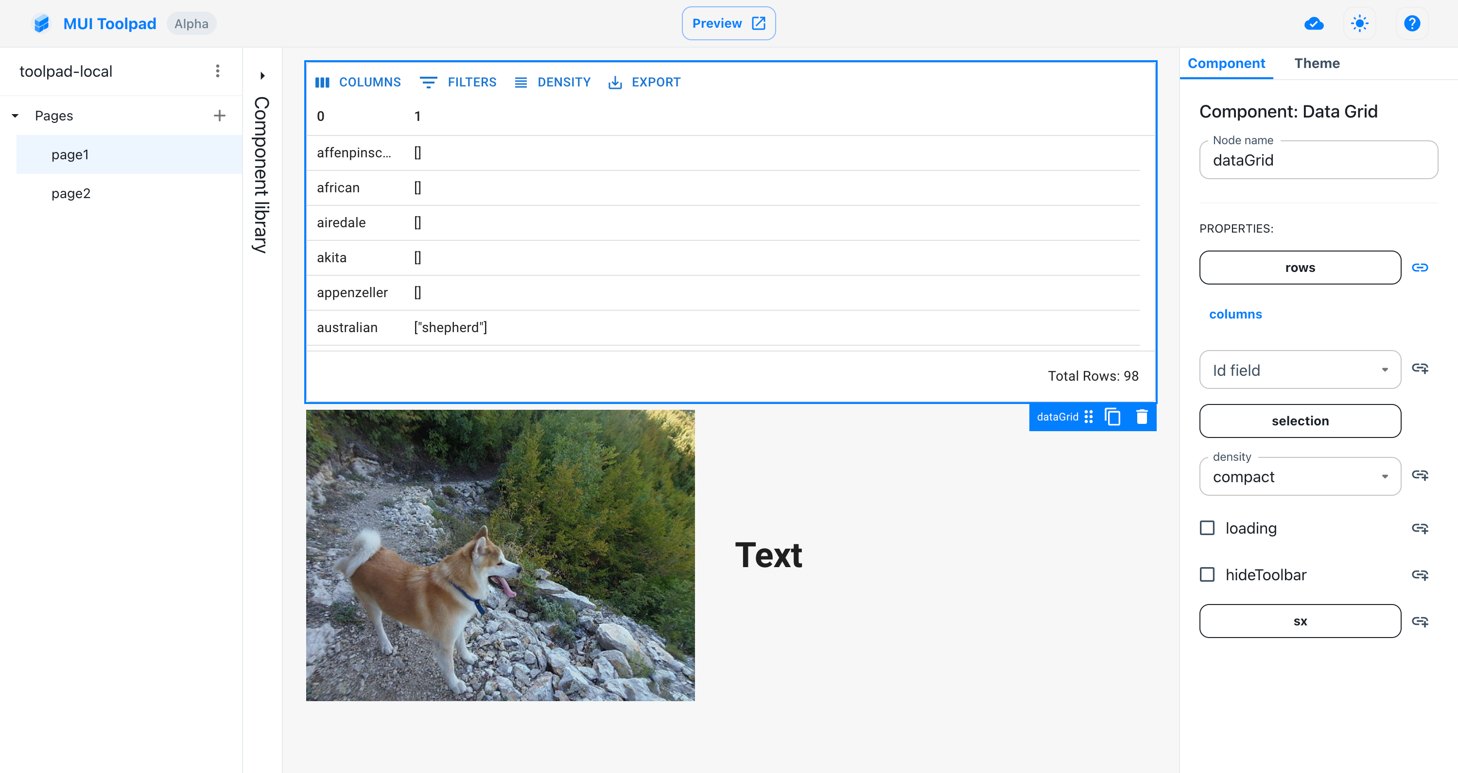
Inspecting the data grid
We'll talk about binding dynamic values to these properties in the managing state section.
Canvas grid
Rows
Toolpad canvas uses a grid layout where you can use rows to position components:
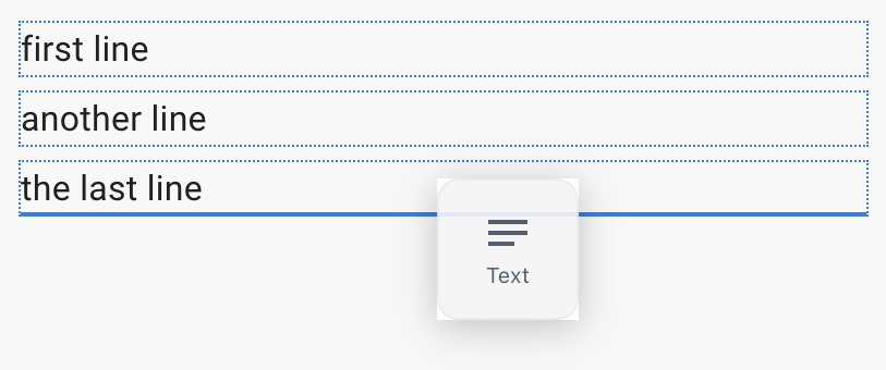
Canvas grid rows
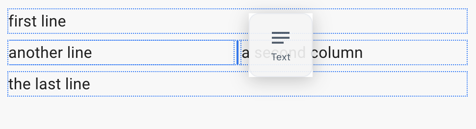
Canvas grid columns
Resizing components along columns